El Fuego / Case Study 01
El Fuego is a branding and digital experience concept built around the idea that food creates connection. I wanted to create a brand that felt rooted in culture and community while also translating naturally into a modern ordering experience. The project combines identity, storytelling, and UI thinking to show how a restaurant brand can live across both physical and digital spaces.
The Big Idea
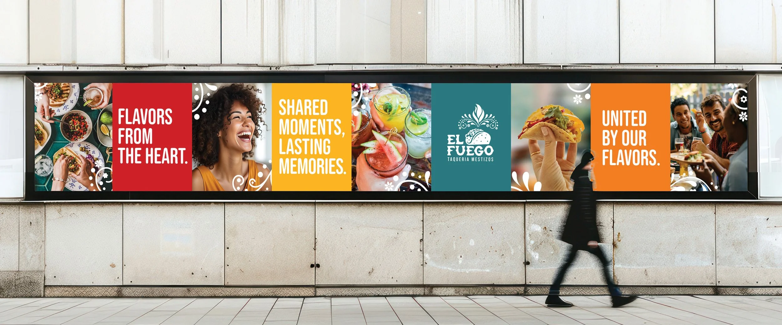
The concept combines bold Mexican flavors, community-driven storytelling, and a vibrant visual system to create a brand that feels both rooted in culture and relevant to a modern audience. That system extends across the mobile ordering interface, packaging, and social media, creating a cohesive experience that feels authentic, current, and engaging.
My research focused on the social and cultural role of food. Sources like Commensal Attraction: Eating Together as a Social Tool, The Omnivore’s Dilemma, and Robin Dunbar’s work on social connection helped reinforce the idea that shared meals build belonging and community. These insights shaped El Fuego as more than a restaurant concept. It became a brand centered on experience, ritual, and connection.
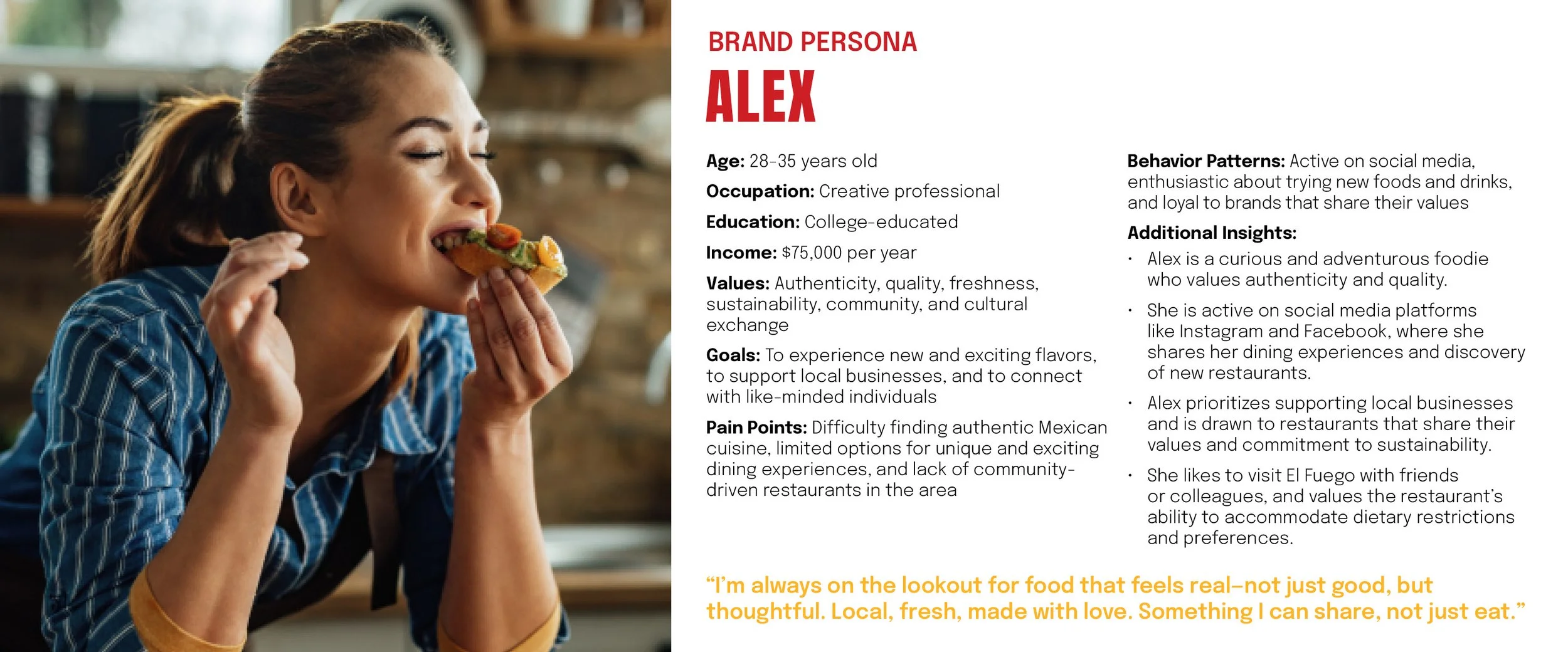
Audience research pointed toward Millennials and Gen Z food lovers who care about authenticity, sustainability, and a sense of community. Insights from one interview participant described being drawn to brands that feel personal, culturally rooted, and aligned with local values. That helped clarify the audience for El Fuego: people who want their dining choices to feel meaningful, not generic.
Research + Audience
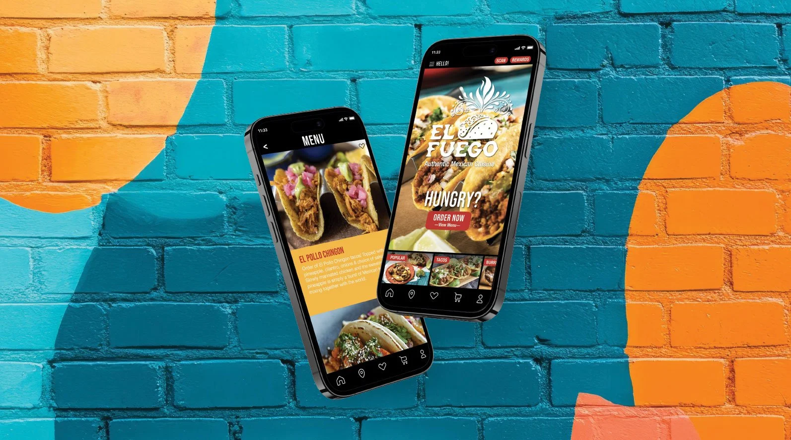
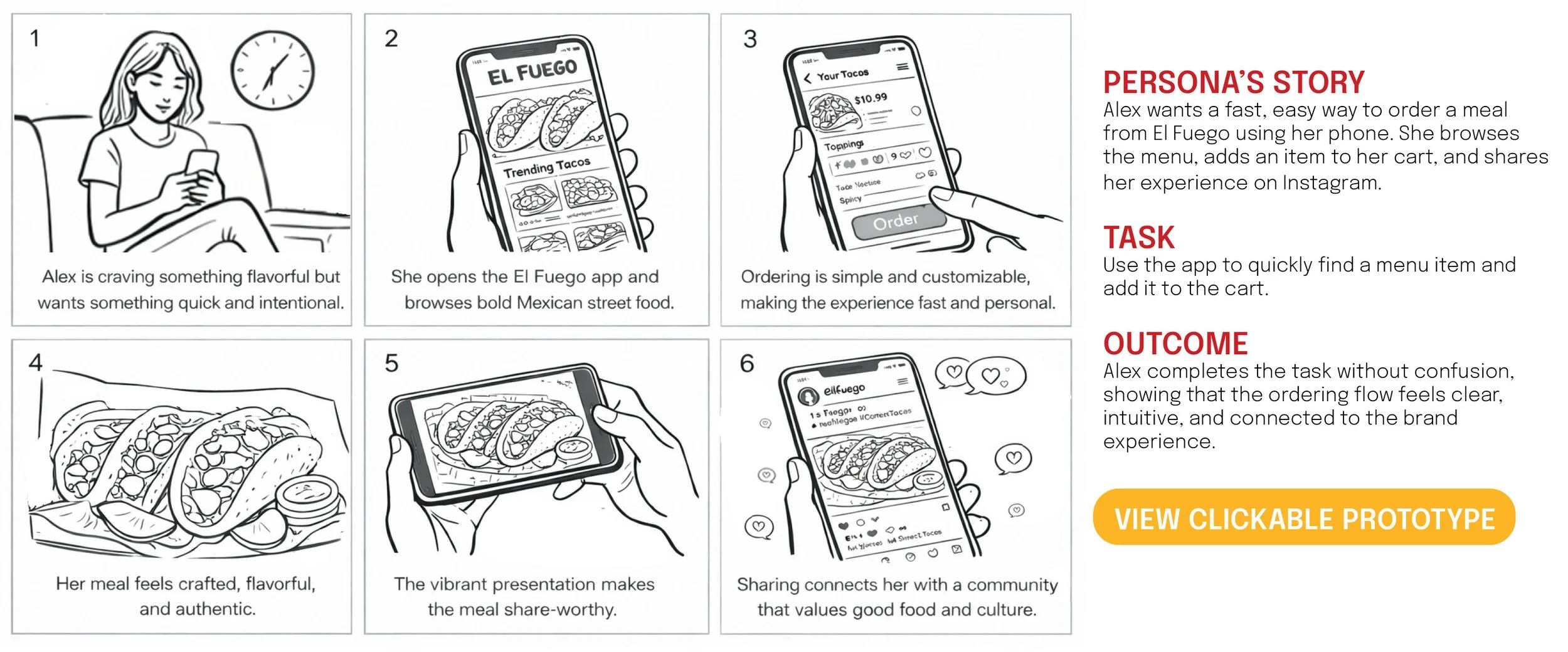
The solution was a mobile-first brand experience that translates El Fuego’s visual identity into an intuitive digital ordering flow. The concept centers on helping users quickly browse the menu, choose an item, and add it to their cart while still feeling the personality of the brand. Rather than separating branding from UX, I wanted the interface to carry both.
The Solution
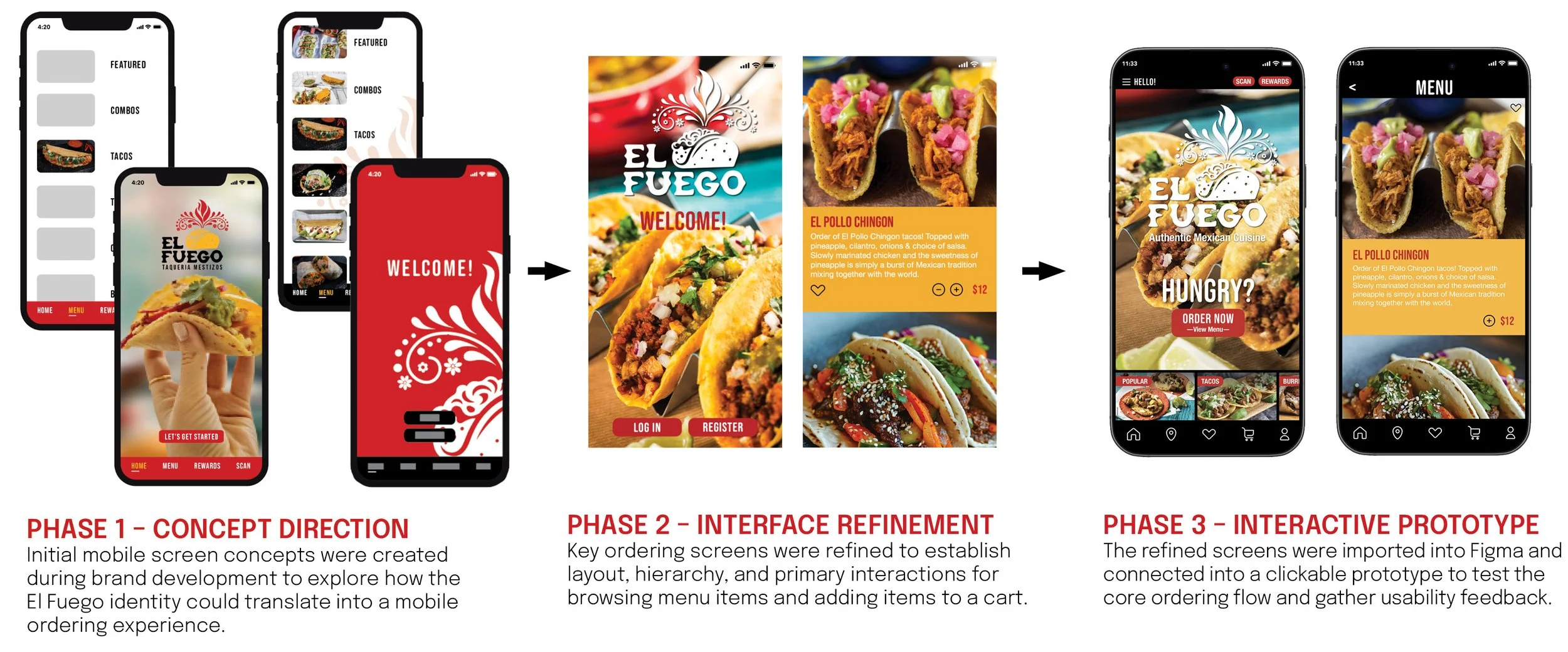
The design process started with early concept exploration to test how El Fuego’s brand identity could show up in a mobile interface. I explored multiple visual directions, experimenting with layout, navigation, hierarchy, and food imagery. From there, I refined the strongest direction into a clearer set of key screens focused on browsing menu items and adding items to the cart. Once the screens were resolved, I brought them into Figma and connected them into a clickable prototype for usability testing.
Design Process
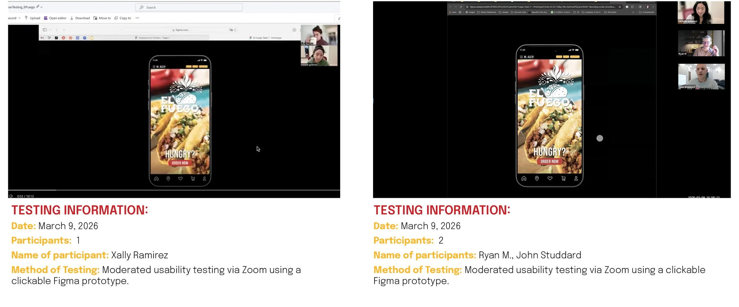
To evaluate the ordering flow, I ran moderated usability testing using a clickable Figma prototype. Participants were asked to select a specific menu item and add it to the cart. Overall, the flow felt simple, intuitive, and visually engaging. Users understood when an item had been added and were able to complete the task successfully. Feedback also revealed areas to improve, including clarifying the “Order Now” language, making the restaurant identity more explicit on the opening screen, increasing button size, and improving menu categories.
Testing + Feedback
The final deliverables include a mid- to high-fidelity mobile prototype, brand applications across multiple touchpoints, and a second design component that expands El Fuego beyond the app experience. This project was designed to show how one concept can live across UI, motion, and branded physical materials while still feeling like part of the same system.
Final Deliverables
This project taught me how to translate a strong brand idea into a functional digital experience. One of the biggest takeaways was learning how to balance bold visual identity with usability, making sure the interface felt expressive without sacrificing clarity. Testing reinforced the importance of language, hierarchy, and feedback in shaping even simple interactions. If I continued developing El Fuego, I would expand the checkout flow, build out deeper menu navigation, and explore loyalty or social features that could strengthen the community aspect of the brand.