Kindness for Kritters / Case Study 02
Kindness for Kritters is a branding and integrated campaign concept centered on pet adoption, emotional well-being, and community connection. I wanted to create a project that felt emotionally grounded while also showing how branding and digital design can support a real social issue. The project combines storytelling, audience insight, and UX thinking to make adoption feel more approachable, compassionate, and clear.
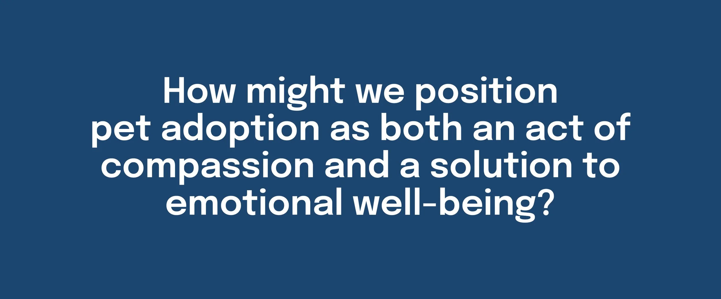
The Big Idea
Kindness for Kritters frames adoption as a mutually transformative experience. The concept connects the needs of shelter animals with the emotional needs of people seeking comfort, routine, and connection, using warm branding, community-centered messaging, and a clear digital path into adoption.
Research + Audience
My research focused on both the scale of the shelter adoption issue and the emotional benefits of companion animals. Sources like ASPCA shelter data helped ground the project in a real need, while research around pets and emotional well-being supported the broader campaign message. These insights shaped Kindness for Kritters as more than an adoption campaign. It became a concept about connection, care, and mutual support.
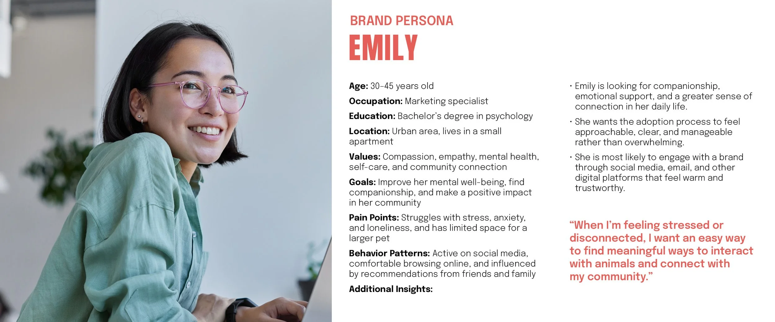
Audience research pointed toward socially conscious adults who care about empathy, mental health, and community, but may not always know where to begin. The persona, Emily, helped define that audience more clearly as someone looking for companionship and emotional connection, while also needing the process to feel simple, supportive, and easy to trust.
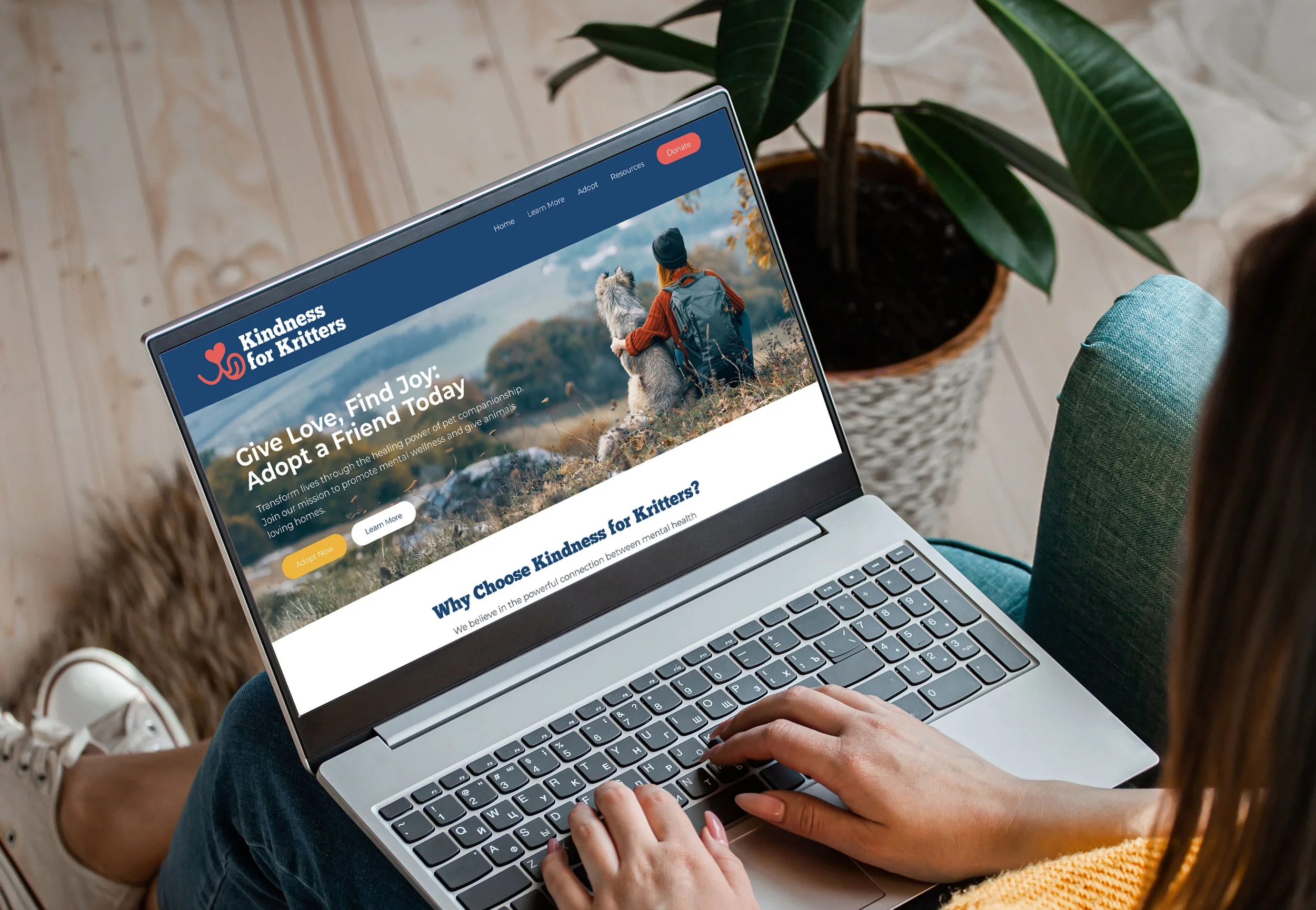
The Solution
The solution was a digital adoption experience supported by a larger campaign identity. I wanted the website flow to feel warm, approachable, and easy to navigate, helping users move from curiosity to action without feeling overwhelmed. Instead of treating the digital piece as just information, I designed it as a guided experience that helps users discover a pet, review key details, and begin the adoption process with confidence.
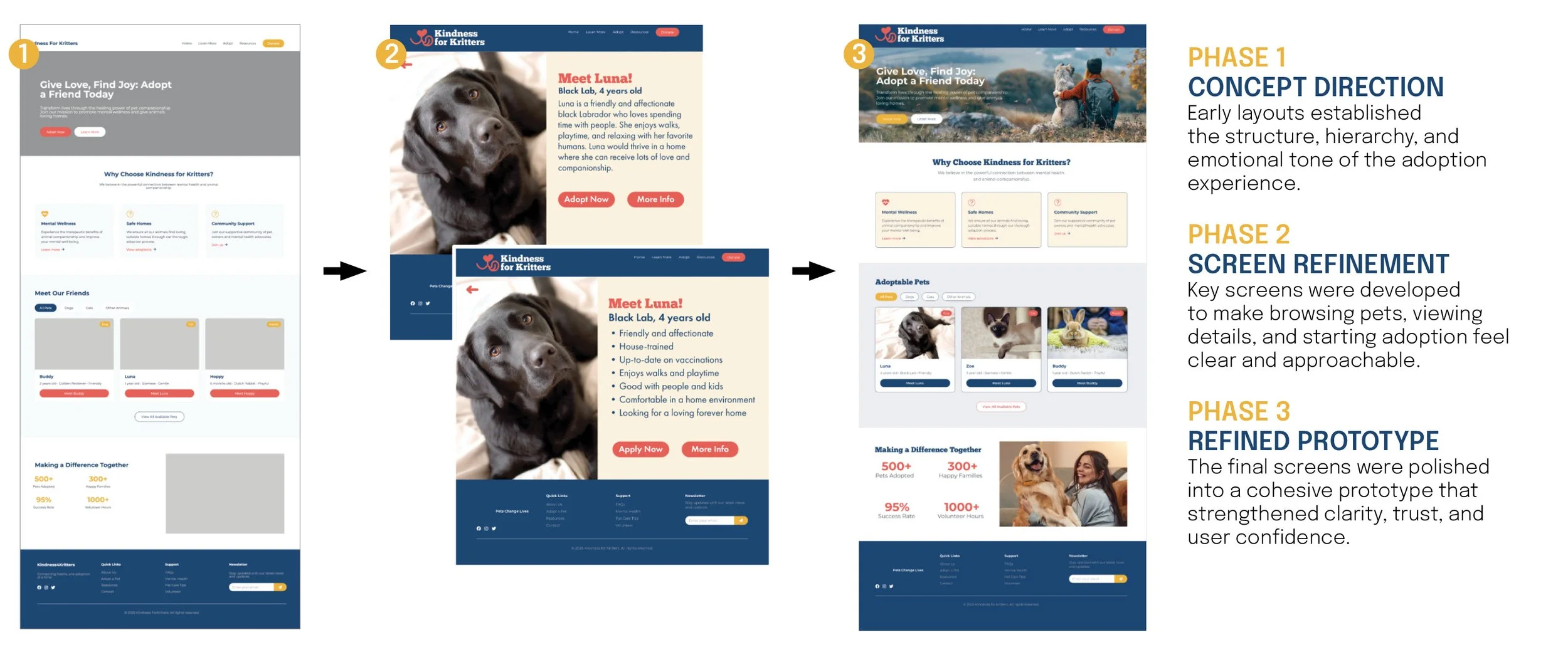
Design Process
The design process started with early concept exploration in Figma to establish layout, hierarchy, and overall user flow. I used template-based starting points to move quickly, then customized key screens to better match the emotional tone and usability goals of the project. From there, I refined the homepage, Luna’s profile, and the adoption entry points to create a clearer and more trustworthy experience.
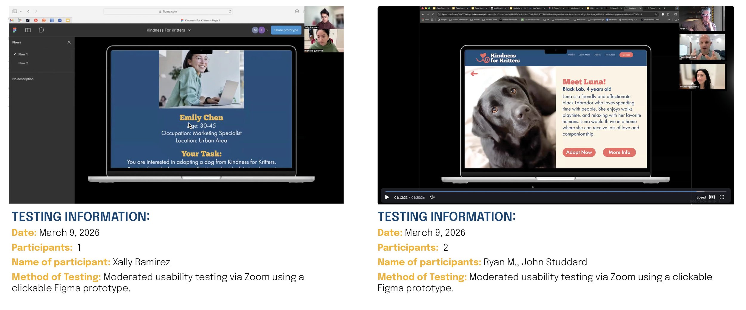
Testing + Feedback
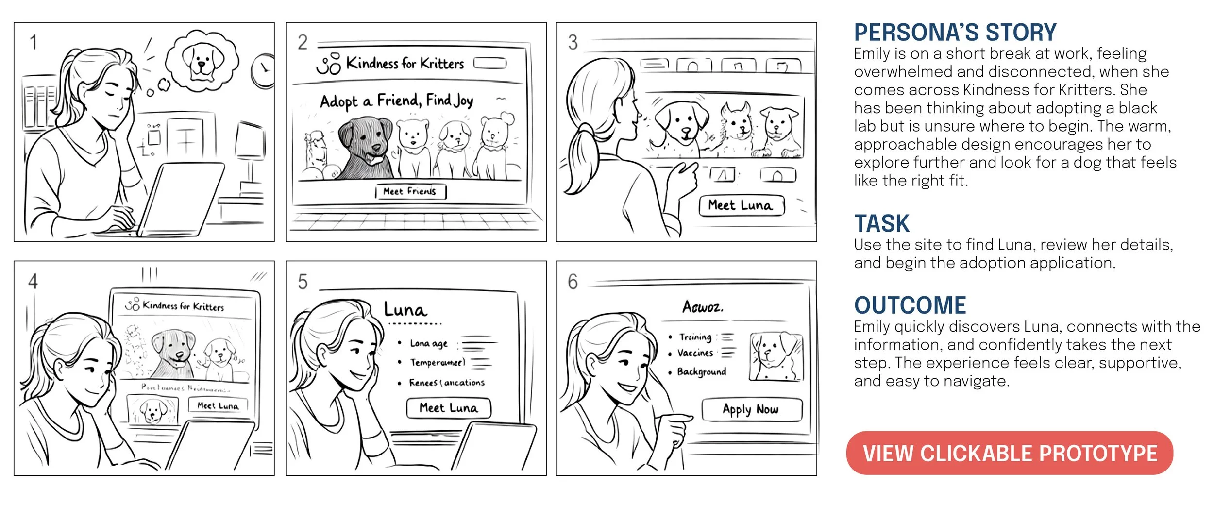
To evaluate the experience, I ran a moderated usability test over Zoom using a clickable Figma prototype. The participants were able to find Luna and begin the adoption flow successfully, which showed that the overall experience was understandable and easy to follow.
The feedback also revealed a few areas to improve. Luna’s description felt too text-heavy and would work better as bullet points, and the section label “Meet our friends” was not as clear as it could be for adoption content. These insights helped refine the content structure and improve clarity.
Final Deliverables
The final deliverables include a clickable digital prototype, the full case study PDF, and supporting brand materials that extend the concept beyond a single screen. The prototype focuses on helping users move from discovery to adoption with clarity and confidence, while the broader campaign system shows how the brand can live across digital experience, motion, and visual identity.
Conclusion
This project taught me how important clarity, trust, and guidance are when designing for an emotional user experience. One of the biggest takeaways was learning that even small changes to content structure, labeling, and readability can make the experience feel much more supportive. Testing helped reinforce that emotional storytelling works best when the user also feels clearly guided through the process.